Website Header Font Needs Change
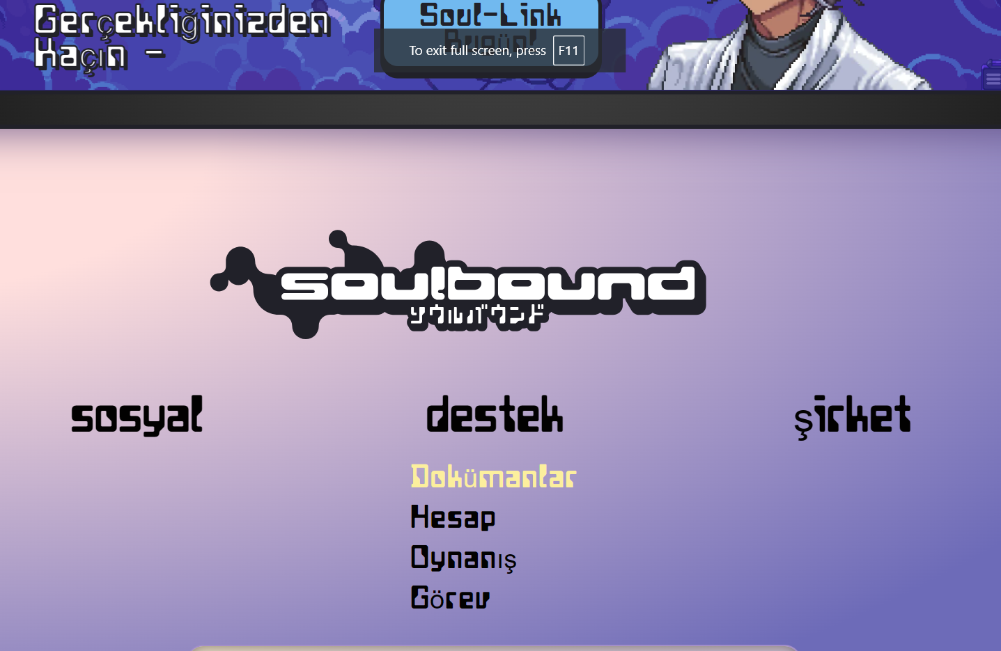
Many others have voiced this, the style of font used on the headers doesn't look great and is hard to read. On top of that, it isn't consistent across all letters from different languages (See attached image below). I appreciate this may not be at the top of the priority list but it is a very quick fix. Thanks, WebbTechnology.
Log in to comment and vote
Comments2
Webb
Jul 7, 2024
Good spot - I think we need a fallback font for different language support.
Is this readable?
_.kallisto._
Jul 7, 2024
Yes, I suppose it isn't exactly difficult to read but for some reason it requires a little more effort take in. My eyes aren't able to glance over the text as it would regularly.