"Items Received" Notifications are obtrusive during dungeon runs
I mean those notifications:

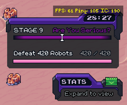
During a playa run those are too big and hide too much screen real estate, right in the middle of the screen. Out of dungeons this is okay, but in dungeons, they are right in the middle, below the HUD information for the Stage + Stats (cf. image below) and they are huge!
Ultimately those notifications serve 2 purposes:
instant gratification - the "I got something" dopamine hit
visibility on what has been collected (and as the notification disappears after a few seconds it's often a miss, with a new notification appearing before players collect everything)
I suggest replacing this with something more subtle, placed in a different place, that stills serves both purposes but in a better way.
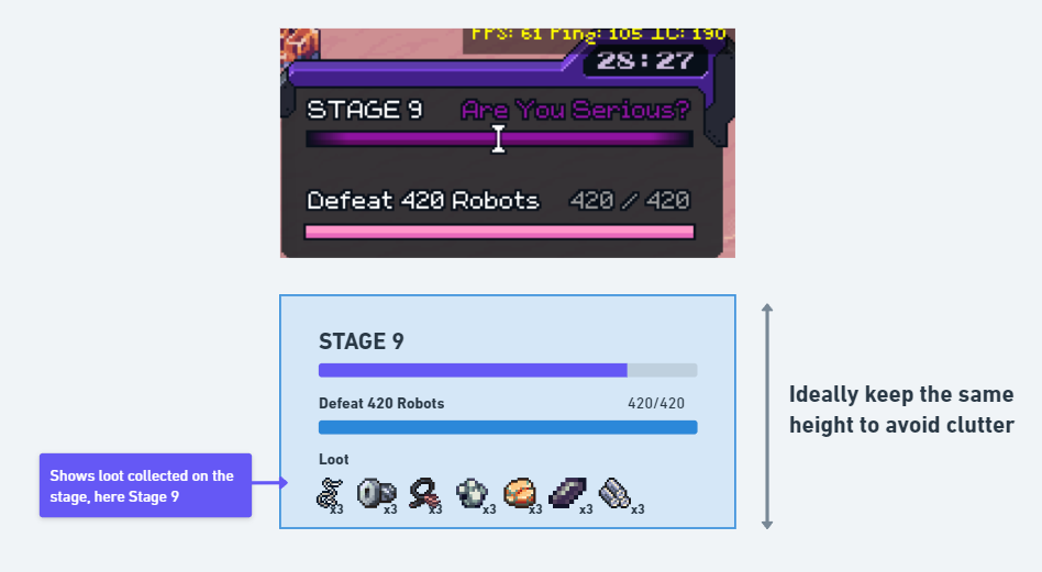
Maybe merging it with the stage status is a good option:
it would stop those obtrusive notifications from hiding the action
it would show all the loot collected on the stage in a better way. A simple pulsing/shaking animation whenever something new is added would do the trick (cf image below)

Please authenticate to join the conversation.
Cancelled
📥 Feedback
About 2 years ago
_blank0o
Subscribe to post
Get notified by email when there are changes.
Cancelled
📥 Feedback
About 2 years ago
_blank0o
Subscribe to post
Get notified by email when there are changes.